Rockwood
Well-known member
- May 5, 2021
- 6,515
- 8,407
Follow along with the video below to see how to install our site as a web app on your home screen.
Note: This feature may not be available in some browsers.

Link?Some highlights from the RDP thread…
View attachment 151761
View attachment 151762
View attachment 151763
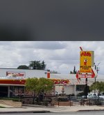
Bahaha! Not even the real deal! We have albertacos, alberts, the real albertos, and probably some others around here.So I grew up eating the best donuts in the world at Mr Crumbs in Yucaipa. The same guy my whole childhood and into my kids early life ran that shop and made the donuts. He retired happily and sold the business to a gentleman that had big plans. Those plans included making it more of a fancy coffee shop/donut shop type place. Feel free to stop in and let me know how you like the donuts.
View attachment 151766
Link?
And there is not nearly enough trash on the ground. No used tires? Not a mattress in sight? Like they didn't even try.
This is Glamisdunes.com a Site that represents Glamis. All the ones with a tire/paddle make it it look lke a tire co logo. With that said, the OG logo is probably the most recognizable logo in Glamis for decades, easily spotted in a sea of flags to find a member or group. My advice try and stick with that thought and try not to make a boring corporate logo out of it.
So I grew up eating the best donuts in the world at Mr Crumbs in Yucaipa. The same guy my whole childhood and into my kids early life ran that shop and made the donuts. He retired happily and sold the business to a gentleman that had big plans. Those plans included making it more of a fancy coffee shop/donut shop type place. Feel free to stop in and let me know how you like the donuts.
View attachment 151766
People can't do that....Sticking with the old school stuff is just too hard. People have to put "their" mark on it, I've seen it for years and years and years....it doesn't work...the old guys will just fade away from the change, and the new people just don't care about stuff like that. How many businesses have been ruined by this need to keep evolving crap....GD is what it is.....People that know, know the logo....people that don't should know the logo. Maybe it's time for ford and Chevy to change their logo's you know it's been a while, and nobody wears Bowties anymore.
Sorry but I think you are looking for a solution when there isn't a problem.
People barely read anymore. If they do, it’s because of some emotional drama on social media somewhere. 280 characters or less lifestyle.A Logo change represents the business change, perhaps addressing negative perceptions, strategic repositioning? You started off great with video reviews and content of builds, mfg. and service vendors that support and cater to the sand dunes crowds...that was good, but it stopped (yeah, we know the family issues, we get that). GD needs the younger crowds, go after the companies and Social Media sensations that the young 20 somethings pay attention to and follow. What is yore goal, to sell more t-shirts and swag? RDP is an active community, so i doubt that's true.
The two biggest obstacles GD has (IMHO) is the following or lack of:
AP Based Social Media Platforms. We do not have any presence on TikTok, Reddit, Discord, Snap Chat, YouTube or X. Whatever GD is up to, needs to be posted in short 15-30 second reels on those platforms, always giving links back to the forum, give an incentive to sign up as a member (Whip Flag, Coozie, Stickers). We have IG and Facebook, but they need attention. This is the biggest way to get GD out to the masses, at least you'll get the looks....GOOD content will get them to comeback. If a person has to log on to GD via the internet, webpage - this site will not grow. It's all about simplification, use plugs and features Xenforo has to allow sharing of forum content to social media.
Social Events and gatherings (Taco Tuesday) build personal relationships, those relationships bring folks back and then they start to participate, buy swag and stay invested. Everyone that is a longtime participating member, went to a Taco Tuesday, etc. They met a fellow board member, built a friendship and started camping together. We cannot be one big happy family, that dynamic never works, but a message board built on strangers/lurkers is just drama (Pirate4x4, HotBoat, MustangWorld, etc.)
So far all the examples shown are the typical AI generic stuff that looks like everyone else's AI generic stuff - boring, will not stand out at all. You could do what everyone else does out of their garage and copy-cat a Coors or Modelo logo and twist it to GD (lame crap, I'm being sarcastic).
I always thought we were Coca Cola (1886) around here, not Pepsi (Choice of New Generation)
Modernize the current logo, we had a more modern version that looked allot like the Dave and Busters scheme just like Fireball Ben said. Don't throw away an established 20 plus year brand.
They all look like shit. Every one of these have a heavy resemblance to foreign logos created by companies that have no intention on maintaining a quality product. This is what I would get from China when they try to get business with any of my Spine or Semi Conductor companies. Low effort, no brain actually used to design... just relying on a computer. This website deserves more and out of 380 examples... this is pretty sad. Not trying to be offensive but I've seen better stuff come out of my High School Graphic Design class in the mid 90's with Corel Draw. Seriously.I have been looking around for an updated logo and used a website called DesignCrowd
After looking through like 380 different ones these were at the top of my list! Of course I’d have to make some minor changes here and there namely just changing the tire style to a paddle or in the case of the simple circle adding scallopsaddles to it but without further ado..
1.
View attachment 151668
2.
View attachment 151669
3.
View attachment 151670
4.
View attachment 151671
5.
View attachment 151672
6.
View attachment 151673
7.
View attachment 151674

